
We’ve all been there. We spent all night chugging caffeine and finalizing a huge report for the higher-ups. The next day, you’re running through your exhaustive data, only to see blank faces staring back at you? What went wrong?
You didn’t make the report easy to follow. You assumed everyone else would speak your language. It’s time to step back and plan a better path for the next presentation. Using data visualization tools can help. We’ll show you some tools worth trying.
Listen to the Full Episode:
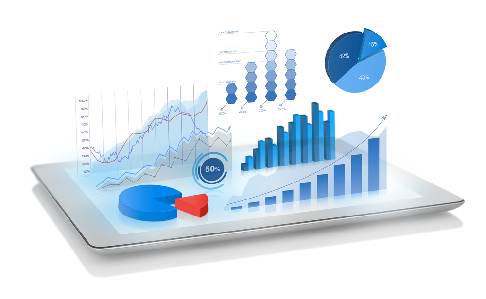 Why Use a Visual Approach to Present Data?
1) Keep it simple for your audience
Less is more and a visual helps focus your objective without clouding the message with words or opinions/subjectivity. Great for measuring against company goals, employee productivity, revenue growth, customer satisfaction, etc.
2) Keep it simple for yourself
Many automated data visualizations update in realtime so there’s no need to build decks. Just grab the data and go!
The Effects of Data Visualization:
-
- “Graphics reveal data features that statistics and models may miss: unusual distributions of data, local patterns, clusterings, gaps, missing values, evidence of rounding or heaping, implicit boundaries, outliers, and so on.” (MIT)
- Data Visualization Market Value is on the rise and projected to hit $7.76B worldwide in 2023, up from $4.51B in 2017 (Statista)
Option #1: Google Data Studio
 Benefits Include:
- Excellent integration with all things Google. If you rely on Google Docs/Sheets/Analytics, etc. this is the tool for you.
- Like Google Docs, you can share Google Data Studio with your colleagues and collaborate on real-time updates
- Build interactive data experiences and embed your Data Studio reports on social media
- It’s 100% free
Option #2: Databox
 Benefits Include:
- Onboarding, implementation, and dashboard customization and dashboard customization
- Real-time data integration and goal tracking
- Assign goals to each of your team members to ensure everyone stays on track and has visibility to see how their performance impacts the overall organization
- Get KPI alerts wherever you are (Slack, email, push notification, etc)
Option #3: Datawrapper
 Benefits Include:
- Focuses on mobile responsiveness first
- Custom brand styling available (colors, fonts, etc)
- Charts may be easily exported as HTML, PNG, PDF, SVG
Option #4: Domo
 Benefits Include:
- An open platform that can extend its functionality to developed app third-party integrations.
- A truly cloud-native solution that delivers that combines Integrated Platform as a Service (iPaaS) for data, real-time visualizations, and predictive insights
- With a few clicks, users can transform Domo using its integration tools
Option #5: Tableau
 Benefits Include:
- Can manage millions of rows of data with ease
- Tableau users can seamlessly integrate other, more complex, scripting languages, like Python or Python R.
Learn More About Smart Data Reporting
- Effective Data Reporting Requires Storytelling. Here’s Where to Start.
- Data Worth Tracking for Top-of-Funnel Audiences
- Data Worth Tracking for Middle-of-Funnel Audiences
- Data Worth Tracking for Bottom-of-Funnel Audiences
Check Out Our Podcast for More Growth-Focused Discussions
This content is from a recent episode of Growth Marketing for Martians, a podcast dedicated to discussing tomorrow's business growth tips -today!
Hosted by Rogelio Rodriguez and Jeff Lambert, these marketing Martians share an intergalactic love for learning and sharing with other podcast space travelers.
Tune in for new episodes each week! Until then, keep reaching for the stars!


.jpg?length=600&name=045%20-%20YouTube%20Cover%20Art%20(Video).jpg)


No Comments Yet
Let us know what you think