
Data Reporting
|8 min read

Last updated on January 20, 2021


Well-executed data presentations help marketers deliver key analytics more effectively. They can also help make people more confident when presenting to intimidating audiences such as company decision-makers.
In fact, 91% of presenters agree they are more comfortable when presenting with a beautifully designed slide deck (Presentation Panda).
As helpful as a well-designed PowerPoint may be, it isn't as easy to create as one might think. It can be challenging to produce a data presentation that is both comprehensive yet easy to understand.
To help make this a less daunting task, we share five tips for improving presentation design and speaking skills below.
 The Problem with Traditional Data Presentations
Did you know, most people tune out of a PowerPoint presentation after 10 minutes (Visme)? Herein lies the problem with traditional data presentations. They lack the originality and creativity needed to engage an audience.
Many fall victim to common presentation mistakes such as:
Like most marketing trends, presentation styles are continually evolving. Stay up to date with PowerPoint's newest design capabilities to transform dated slide decks into engaging stories.
Next time you're presenting a more analytical topic, incorporate these five tips to showcase your data points and impress higher-ups.
 Tip #1: Tell a Data-Driven Story
When presenting marketing analytics such as email open rates or the number of impressions, some presenters simply state the statistics as is.
But how effective is this? Not very.
Studies show people are 22 times more likely to retain data points when wrapped in a story (Forbes).
Data presentations can benefit from having more character and personality. This approach often starts with creating an outline of what information you want the "story" to portray.
The way marketers present data has a significant impact on how decision-makers process that information. Don't be afraid to add personality and a narrative to your presentation, so they remember your message.
 Tip #2: Let's Get Visual
Paragraphs of text boxes are not the only way to explain your findings. When used excessively, it can hinder data presentations. After seeing multiple slides full of text, the information starts to blend.
Instead, utilize data visualization or the use of relevant images and icons to support your story. This method is a great way to make numerical data more digestible and engaging for your audience.
To display statics and numbers, use data visualization types such as:
Many free online platforms allow users to create professional-looking graphics quickly. Canva, Snappa, and Piktochart are great options to consider.
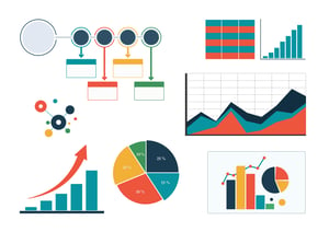 Tip #3: Use the Appropriate Charts and Graphs
While utilizing data visualization is essential when creating a slide deck, the types of charts should be chosen strategically. Including the wrong visual aid can cause a misrepresentation or confusion of the data.
For more context, here are a few examples of different charts and how presenters can use them.
Before choosing a chart or graph, think through what message you are trying to convey. Choosing the wrong data visualization can showcase a misrepresentation of your findings.
 Tip #4: Don't Get Lost in the Details
With many marketing KPIs and tracking metrics at your disposal, it is tempting to share every single data point available. However, presenting too many details at once easily confuses those who are seeing these findings for the first time.
To keep your slide deck concise, Rizen Corp recommends highlighting one significant finding per chart. Think to yourself, "What is the most important point I want my audience to remember from this data?" And you have your answer!
It is best practice to only highlight one significant finding on each slide. The easiest way to confuse leadership teams is by sharing too many analytics and data points at once.
 Tip #5: Practice Makes Perfect
Unfortunately, it's not enough to just create data presentations that are visually appealing and easy to understand. Marketers must also focus on how they present their insights to decision-makers.
According to a study conducted by SOAP presentations, the three elements that most contribute to powerful presentations include:
This figure shows just how valuable it is for marketers to become confident in presenting complicated material. It is unlikely a skill that most are born with. Therefore it must be practiced to truly be mastered.
Curious to learn what other skills you should be focusing on? Please read our blog post, 5 Skills Marketers Need by 2025.
A data-driven presentation requires more than just a well-designed slide deck and engaging content. It's just as essential to have excellent presenting skills to convey your message to higher-ups.
When building your next data presentation, remember the importance of delivering numbers in an understandable fashion. The success (or failure) of your report will rest on your ability to accomplish this feat.
Before your next report arrives, consider checking the quality of your data! Rizen, a revenue-growth company focused on partnering with pro marketers, we can help you build, visualize, and optimize your entire data reporting strategy.
We've helped marketing departments scale in record time, and we can help your organization do the same. Contact us today for a free consultation!
These Stories on Roofers


No Comments Yet
Let us know what you think