
Growth Driven Design
|6 min read

Last updated on November 17, 2020

Now that prospects have found their way to your site, the last thing you want is their first impression skewed by a poor experience. Sometimes, even the smallest details make a big difference in turning a visitor into a customer.
Even some of the most popular websites have trouble addressing pain points for their visitors. Depending on the issue, it can be a complicated process to fix. But, there are some common issues with simple fixes that you should be aware of to avoid missing conversion opportunities.
Let's look at the most common bad website design sins and help you fix the ones you're guilty of.

As ad-blockers grow in popularity, your QA process should ensure your site is compatible with them. If your site doesn't function properly when a visitor uses an ad-blocker, you will miss out on opportunities.
Additionally, issues with ad-blockers will diminish trust in your site, even if it's due to a simple error.
The first step is to check for blocked resources. There may be something in the name of the resource that is erroneously triggering the filters. Try renaming broken resources to something that doesn't sound like an ad.
If you're still having issues, you may be able to ask the list authors for an exception.
The design of your site conveys a message in itself. But, if not careful, the design features may obscure the purpose of your services.
It is imperative to pay close attention to the words and flow of information, not just the aesthetics, to ensure your message is received loud and clear.
Make sure you do not isolate new visitors by using jargon or overly complicated terms to describe your business. You want your purpose to be clear, so be sure to point out specific services and benefits, not vague proposed platitudes.
Lastly, check for spelling, keyword stuffing, and grammatical errors to ensure the information flows smoothly. It's always a good idea to let your mission statement guide how to make your first impression.
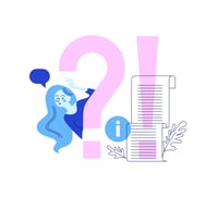
 One of the most common pain points for users is finding the relevant information they need. Your information architecture may make sense to you, but does it reflect how a new visitor would search for information?
Remember, you can only make one first impression. Understanding your customer's journey from the moment they arrive at your site is essential to crafting the best experience from beginning to end.
To better understand this step of your customer's journey, consider enlisting innovative new technology to organize user-experience data into actionable improvement steps.
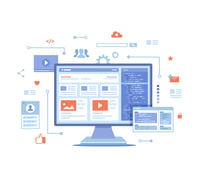
 It seems almost like a no-brainer to ensure that your site's layout and navigation are simple and responsive for mobile users. You also don't want to neglect newer features like a "click to call" button for your phone number.
Adding a "click to call" feature is simple and will streamline a prospect's journey, which may lead to increased connections and opportunities.
 If a visitor feels like an answer is too hard to find, they're much more likely to abandon their journey on your website. The more accessible and direct your navigation is, the easier the customer's journey.
Keep the number of steps needed to find information at an absolute minimum. For example, suppose you're running a promotional ad. In that case, the link should directly click through the product or service the ad promotes. It should not send the user to an irrelevant page, leaving the user on their own to search for more information on the promotion.
The overall goal of addressing these common website pain points is to improve accessibility, cohesion, and consistency throughout your site. A growth-driven design is the simplest way to boost your customer experience to be as smooth as possible.
Traditional website design is a long and drawn-out process that yields unpredictable results. You can only launch once the entire site is complete. While some flexibility is built-in, relaunching the site after modernization can be a tremendous headache.
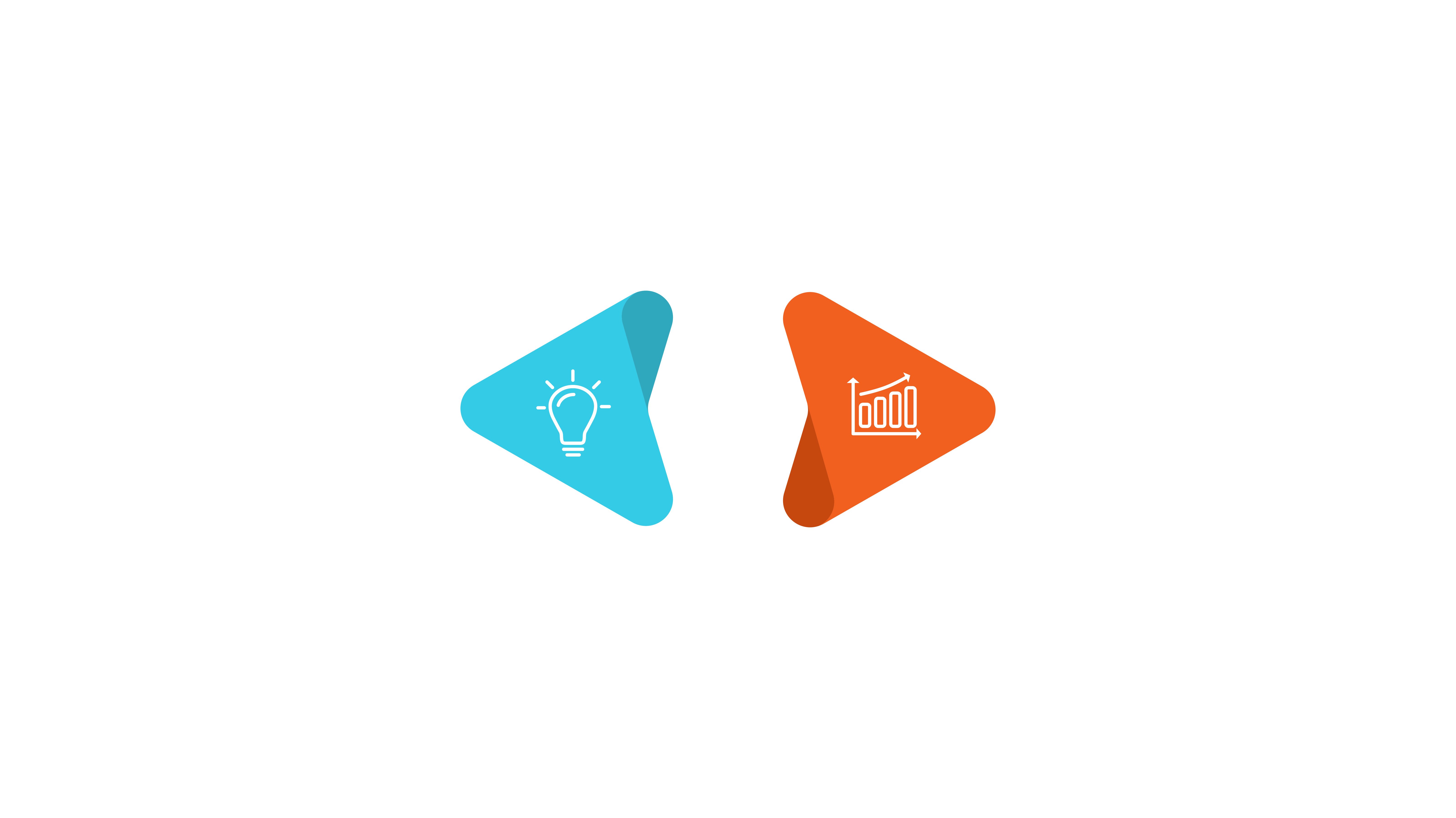
Conversely, growth-driven website design focuses on launching quickly and scaling the site on-demand. You're building a foundation based on the 20-80 rule: Quickly launch 20% of the pages that deliver 80% of the results. In time, you can build upon the foundation to achieve the site you envisioned.
Additionally, the growth-driven method is an excellent way to stay on top of addressing pain points like those mentioned above. Instead of sifting through a mountain of user-experience data from numerous pages, you can see a streamlined version. This proactive approach will also help guide your process as you build the rest of the site.

At Rizen, we're committed to providing you with the most up-to-date and successful marketing services to help your business grow.
We're a HubSpot-certified GDD partner that can provide comprehensive consulting and training for every business stage.
We want to hear from you! Contact us today to discuss your goals and experience the Rizen difference.
These Stories on Roofers


No Comments Yet
Let us know what you think