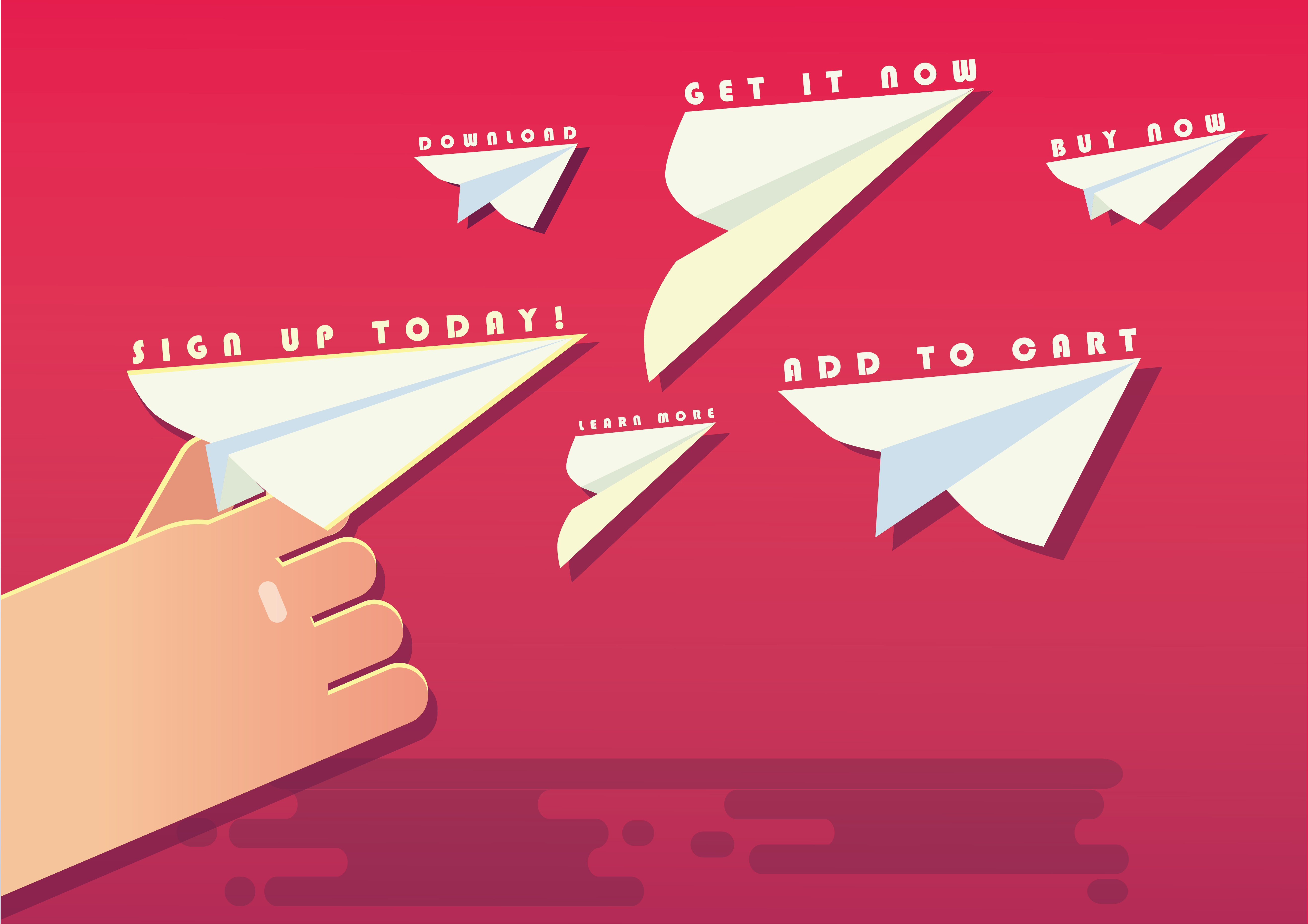
As part of your marketing strategy, it’s a good idea to provide website visitors with an opportunity to download additional content. These opportunities should provide even more value to their visit, as they are trusting you to help solve their problem! Using call-to-action buttons (CTA’s) provides a way for you to interact with your potential customers in a more meaningful way.
So what’s an example of a call-to-action button? Say you’re a company that sells jet skis, and you’ve been creating content to help attract people interested in this hobby to your service. You may have created a blog post about the best types of wax to keep your new jet ski looking like new. As part of that blog post, you’ve inserted a button to download a checklist of jet ski maintenance steps to perform every 6 months. Your visitors will certainly be interested in downloading this offer because it’s of value to them!
Overall Design Tips
When creating your CTA buttons, you want them to grab the reader’s attention and draw them in. Good design solves for this. Don’t skip this step! Just keep in mind Rizen’s P.C.A.L. Rule to make those call-to-action buttons truly irresistible!
- Preference - think about which buyer persona you're trying to attract and what they would react positively to. Would they prefer something subtle or flashy?
- Contrast - Your button should stand out on the page you’ve placed it. A good rule of thumb is to use contrasting colors to the existing content on the destination webpage.
- Action - Make the button wording inspire visitors to take action now! Make sure the language is also clear in terms of what they’re going to receive.
- Location - Rizen recommends placing a CTA button at both the top and at the end of the article or webpage. This way, people can either dive in right away or have another engagement opportunity after interacting with the existing webpage content.
Now that you have a general guide for designing call-to-action buttons, let’s look at some ways to word your buttons to make them irresistibly clickable!
Idea #1: The Simple Invite
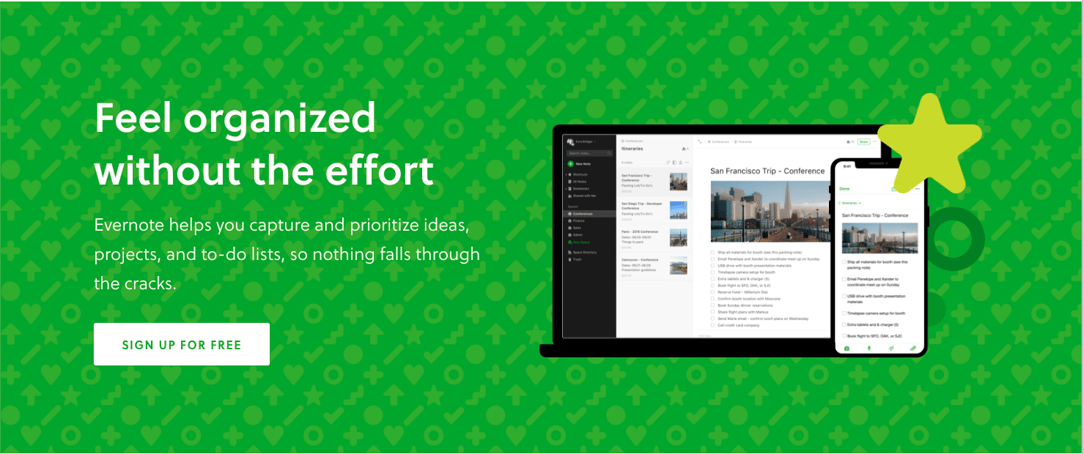
Your customer is new to the site, so keep it general, with no pressure applied! Use this option to invite visitors to sign up for a free webinar, a service trial, or an external event. You wouldn’t start a first date by being too pushy (we hope), so treat your CTA’s that cater to first-time visitors in the same way. Evernote knows how to grab attention in an effective way without being overwhelming.
Idea #2: Inspire Curiosity
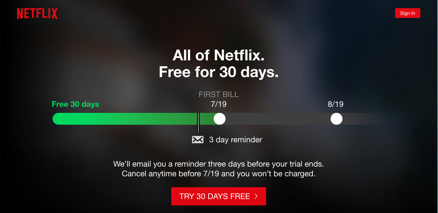
Persuasive text can be a powerful way to guide website visitors to content interaction. Use language that leaves a little to the imagination for the reader, so their curiosity drives them to want to check out your offer. Some other variations of this strategy could be:
- The promise of a better life (Take Control of Your Future)
- An offer to increase an important metric (Increase Sales Now)
- Entry into an exclusive community (Join 10,000 Already Satisfied Customers)
Take a look at how Netflix employs this strategy to attract new customers:
Idea #3: Offer a Choice
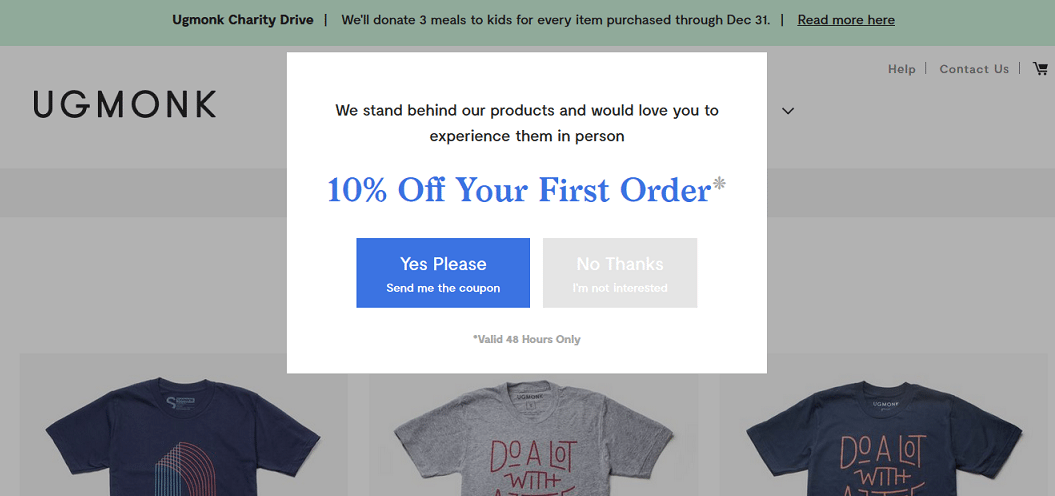
The modern customer like to feel in control of their experience. Your job is to attract them! What better way to do that than by offering a choice in your CTA? When you prompt users to download, try, or subscribe on your site, make your offer more than just a click quick to shoo it away. Give the customer a reason to think it over. Just by creating a two-option banner, you’re asking your visitor to participate in sharing how effective your CTA is!
Ugmonk does an excellent job of employing this strategy on their site:
Idea #4: Try Before You Buy
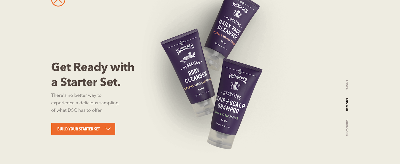
Everyone likes a free lunch, right? Consider giving site visitors a chance to sample the menu by offering a free trial offer. If you believe your product can stand on it’s own in terms of features and value, then you need to give people the opportunity to experience that without the hassle of canceling a service. And think about other ways to offer a limited-time opportunity than by saying “free trial” every time. Look at how the folks over at Dollar Shave Club advertise their free trial option:
Idea #5: Let Them Stay Connected
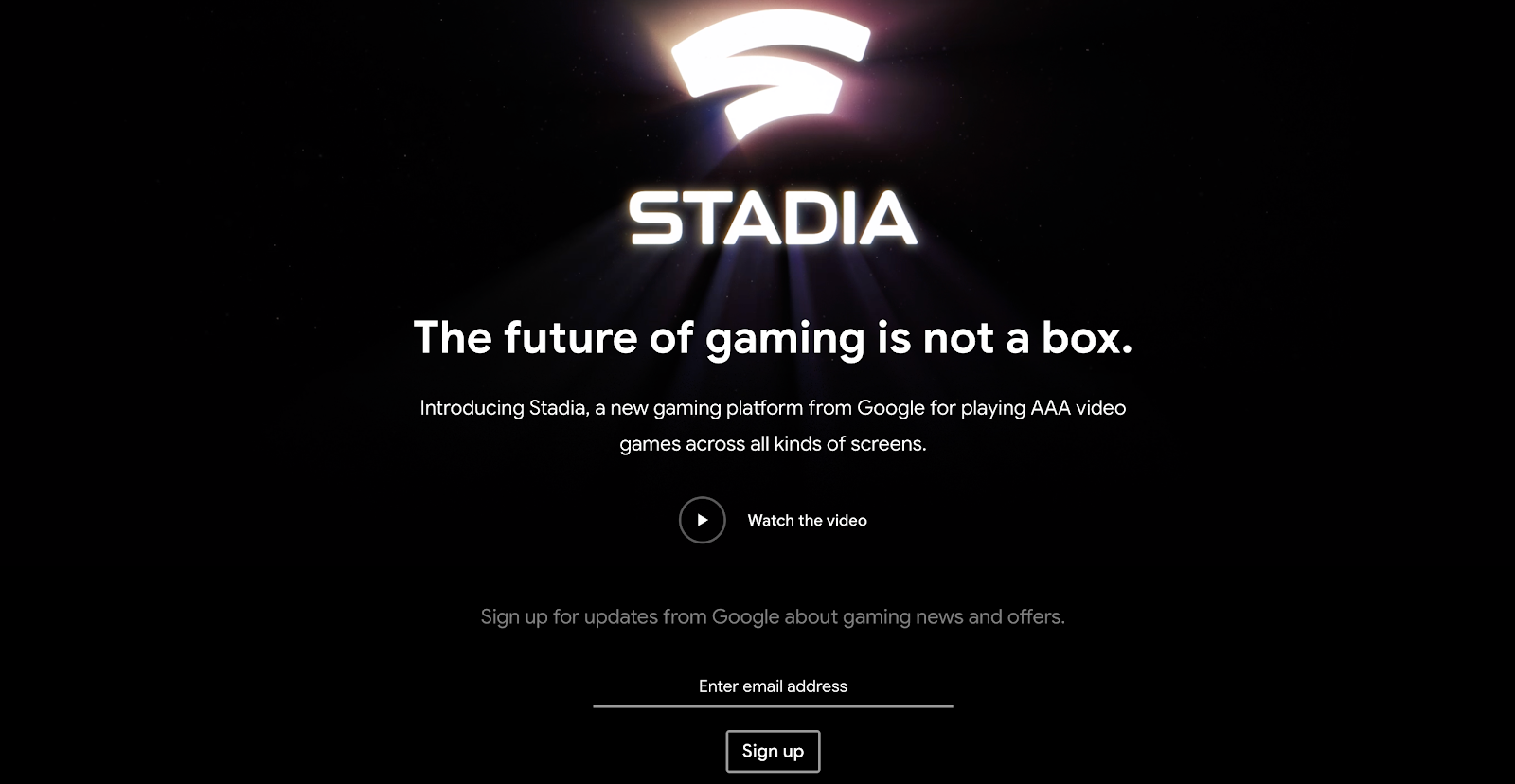
Website visitors in the attract or engage stages of the buyer’s journey may not be ready to purchase or subscribe to your product, and that’s okay. Interest is a great starting point! With that in mind, use your CTA’s to offer an opportunity for engaged individuals to receive future updates. Just make sure to be clear about how they will receive the update(s) and how frequently they will occur. Transparency is important when asking people to share personal information such as an email or phone number. Google’s new Stadia service for game streaming immediately engages interested parties by offering them an opportunity to be the first to know about future updates.
Bonus Idea: An Opportunity to Share
Using graphic design tools like Canva or Adobe Spark makes it easy to create CTA buttons even if you have little to no design experience. Once you create your design, add a link to let people share your blog post, video, or other awesome content easily on social media. Not sure how to create a shareable link to Facebook, Twitter, or Instagram? Check out Hubspot’s excellent guide on how to create custom sharing links in under 5 minutes.
Ready to Learn More?
The team here at Rizen knows how to reach today's customer. We can teach you how too! To get started, learn all about the blueprint for modern customer relationships with our free Inbound Marketing web guide. We'll show you all the basics of things like inbound principles, the buyer's journey, keyword research, lead nurturing, content strategy, and so much more!
If you're ready to partner with an experienced, friendly, and results-driven marketing firm, contact us today to get started. We can't wait to hear from you!




![Reignite Your Millennial Marketing Efforts With These [On Fleek] Ideas](https://blog.gorizen.com/hs-fs/hubfs/Podcast/009%20-%20Millennial%20Marketing%20Blog.gif?length=600&name=009%20-%20Millennial%20Marketing%20Blog.gif)


No Comments Yet
Let us know what you think