The home page of your impact windows website is much like a home's curb appeal. Do you think a house would quickly sell with chipped paint, an overgrown lawn, and cracks in the roof?
Probably not.
Similarly enough, a well-designed homepage is essential to selling hurricane windows and doors to today's consumers. Oftentimes it's the first thing a potential customer sees when they visit your impact windows website. Therefore it is crucial users are instantly impressed as soon as the page loads.
But, it's not enough for your website's "curb appeal" to wow site visitors. It is just as important that you design your homepage to convert leads quickly. It should be free from roadblocks and poor user experience elements that cause people to leave your website.
In this blog post, I'll share the necessary elements of what makes an effective, well-designed home page.

The Importance of a Top-Notch Impact Windows Website
If you're reading this blog post, you have probably already discovered that your website directly impacts the perceived quality of your impact-rated products. However, very few business owners understand how monumental this correlation is.
Here are a few eye-opening statistics that showcase how your website design can impact a user's next steps.
- It takes half a second for users to form an opinion about your website that determines whether they like your site or not, whether they'll stay or leave (Taylor & Francis Online).
- It takes 2.6 seconds for a user's eyes to land on the area of a website that most influences their first impression (CXL).
- 57% of internet users say they won't recommend a business with a poorly designed website on mobile (socPUB).
- 38% of people will stop engaging with a website if the content or layout is unattractive (HubSpot).
- 75% of consumers admit to making judgments on a company's credibility based on the company's website design (Kinesis).
- If given 15 minutes to consume content, two-thirds of people would rather read something beautifully designed than plain (HubSpot).
Actionable Tip: 💡
The common saying, "don't judge a book by its cover," does not apply to website home pages. Instead, they are subject to extreme snap judgments. While this may feel like a massive undertaking, I encourage you to read on and implement the tips outlined below.

What Makes for a Strong Home Page? Especially for Impact Windows Websites?
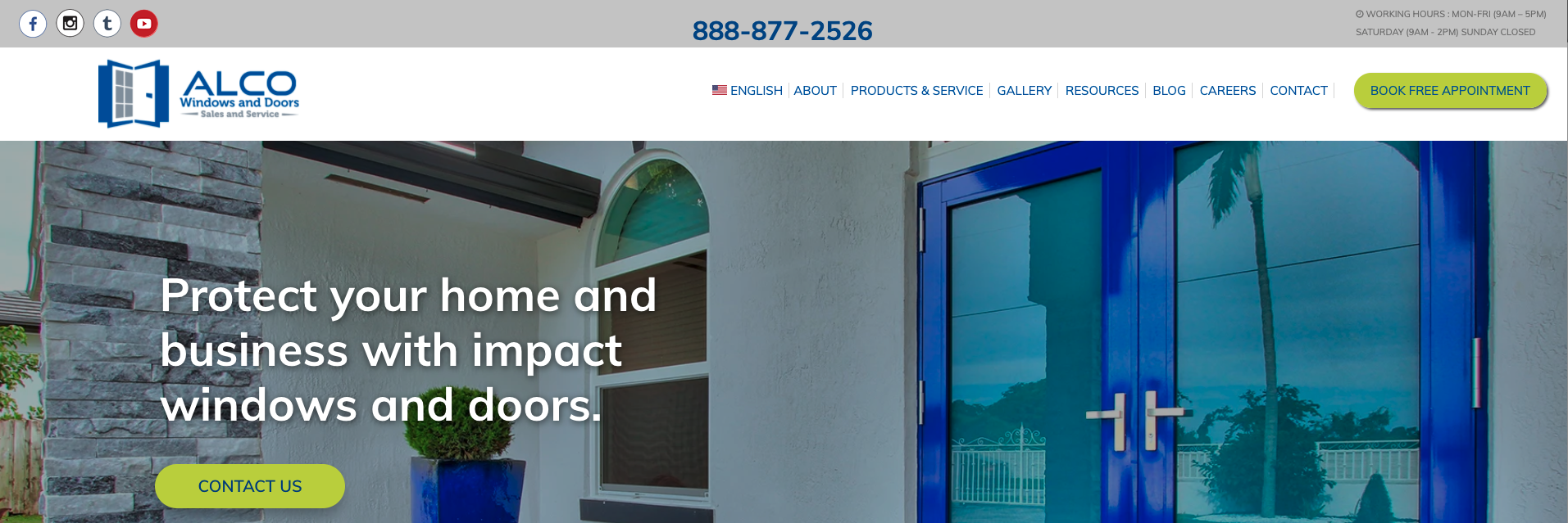
#1) A Compelling Headline
When someone first arrives at your website, is the message of your products and services clear? Will it resonate with homeowners and potential customers?
For instance, when a new user lands on your home page, it should take less than a second to learn that you install impact-rated windows. This objective can be accomplished in a short, compelling headline placed front and center of your home page.
#2) A Simple Design
Your impact windows home page should be pleasing to look at. It is easy to get carried away with images, icons, and colors to make a page stand out.
However, in most instances, abusing design elements causes the page to be overwhelming for the user. Their eyes don't know where to look or what action to take.
Therefore, it is essential to stick to your brand's colors and include minimal, easy-to-read fonts.
#3) Include a Clear Call-to-Action (CTA)
Your website visitors must clearly understand the action needed to contact your team or set up an appointment. A CTA is necessary to provide a direct path for potential customers and generate more business from your website.
While this may seem like common sense, many websites bury the lead. 70% of small business websites lack a call-to-action (CTA) on their homepage (Business2Community). Do not make this same mistake.
#4) Establish Trust and Authority
Installing impact products is a significant home improvement. Therefore, people want to choose a vendor that they can 100% trust. One effective way to accomplish this on your home page is by sharing social proof with customer reviews.
Another option is to include an updated feed of blog posts. As a result, you can showcase thought leadership pieces such as "5 Tips for Hurricane Season" or "Does Florida Building Code Require Impact Glass Windows?" Not only does this element showcase your authority, but it encourages users to interact with your website more.
Actionable Tip: 💡
In short, a great homepage is simple and straightforward. Try implementing one or two of these elements and measuring the results. Optimize, measure, evolve, repeat.
Why Consider Growth-Driven Design for Website Planning?
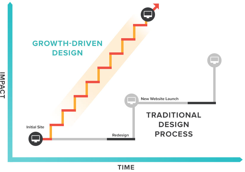
The task of redesigning your impact windows home page can feel like a daunting task - but it doesn't have to be. Consider implementing a growth-driven design (GDD) approach where brands make small, quality improvements based on website data.
For a better understanding of a GDD approach, let's take a look at two different scenarios.
Scenario One: Designing a Website Based on a Traditional Approach
In 2019 a Fort Lauderdale-based impact windows and doors company spent six months redesigning its website.
The process included several meetings with the team to share their ideas, feedback, and suggestions. The project also required significant upfront costs that drained most of their marketing budget for that year.
Fast forward to today, and the website design shows ZERO updates since its initial launch. As a result, the company must follow the same lengthy redesign process to stay relevant to new trends.
Scenario Two: Designing a Website Using a Growth-Driven Approach
A competing impact product business follows a growth-driven design approach to its website development. Instead of redesigning everything at the onset and leaving the website alone for years, their goal is to make small, monthly changes.
For this team, it is not about the number of changes but the quality. Then, based on customer feedback, website data, and interaction patterns, the impact window company can continually improve their site.
There are many benefits to following a GDD approach, such as:
- Significantly lower-up front costs so that your marketing budget is open to other strategies.
- The time it takes to launch or redesign a website is dramatically reduced.
- Continuous improvements can occur on your website based on up-to-date metrics and UX best practices.
Actionable Tip: 💡
Failing to follow a growth-driven approach is not the only common mistake we see with impact window companies. Learn more about the potential errors you are making that are preventing increased leads and higher revenue. Watch our free video, 5 Mistakes You're Making with Your Home Services Marketing.
Design Your Impact Windows Website with Rizen
As a business owner, you wear many hats. From staffing and management to planning and strategy, financials, sales, and customer service, your responsibilities are endless. So let us carry the task of creating a well-designed, lead-generating impact windows website.
Rizen is a full-service marketing agency that specializes in the home services sector. We work with impact window and door companies like yours to grow year-over-year predictably and safely. To learn more about our solutions, call us at 305.548.8464 or complete an online form.
Need to see some actionable results of our work first? I like that about you. By reading the case studies below, discover how Rizen has built successful partnerships with other home service companies like yours. If you like what you see, join our group. You won’t regret it!
- Case study for Alco Windows & Doors
- Case Study for Biosweep Southeast
- Case Study for Garage Door Medics
The Thriving Impact Windows Company Cheat Sheet
- 8 Secrets to Succeed at Impact Windows Marketing This Year
- What is Digital Marketing? Why Impact Windows Companies Should Do It
- 5 Low or No-Cost Ways to Market Your Impact Windows Business
- Why You NEED to Create Content to Promote Your Impact Windows Business
- 6 Ways to Make Your Impact Windows Content MORE Engaging (& Effective)
- What is a Case Study? Important Tips for Impact Windows Companies to Show Off Their Success
- Can I Sell More Impact Windows Using Paid Advertising?
- How to Build and Launch Your First Impact Windows Google Ad


No Comments Yet
Let us know what you think